My Data Analysis Projects
Listed below are some of the data analysis projects I have personally worked on.
Restaurant Analysis Using Python
Analysis of different world cuisine types, in order to identify the most popular cuisine, the revenue generating restaurants, and when we have the most sales (Weekdays or Weekends).
MSleep Analysis Using R
In this project, I have demonstrated my understanding of Tidyverse in R with one of the inbuilt datasets, the mSleep dataset. A few visualisations were plotted using the gglot package.


Dashbourd Building Using PowerBI
This project aims to analyse the data on Udemy courses to determine which topics are currently trending and identify potential opportunities for course development. A second aim is to analyse its financial data to identify which ones are the most profitable for instructors, based on factors such as the course price, the number of enrolments, and the course's rating. And the last aim is to analyse the data to determine which factors (e.g., course price, course duration, number of lectures, instructor reputation) have the greatest impact on course popularity and use this information to inform course development and marketing strategies.
Covid-19 Analysis in SQL
I have used SQL also to understand the Covid-19 dataset from January 2020 - March 15,2023. Analyzing the total cases by continent and country, total deaths, total vaccinations administered till date and the percentage of each country’s population that has been fully vaccinated


EDX Courses Exploratory Data Analysis Using Tableau
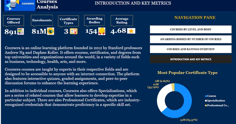
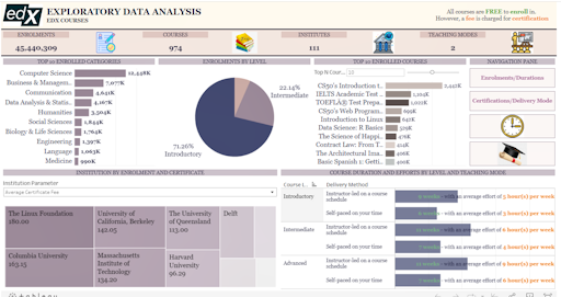
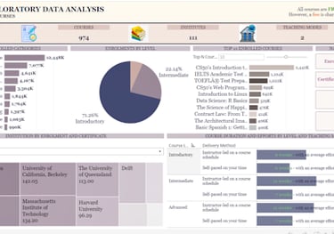
In this project, I have analysed the EDX courses to get insights into their most demanded courses, the types of certificates they offer, the institutions they partner with, etc., and to understand the needs of customers. This was used as part of my market research analysis for a startup e-learning provider.
The data was cleaned in Excel before being imported into Tableau for visualisation.
This dynamic and comprehensive analysis supports decision-making for stakeholders, highlighting popular courses, certification modes, and trends in education delivery.
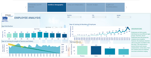
HR Data Analysis in Tableau
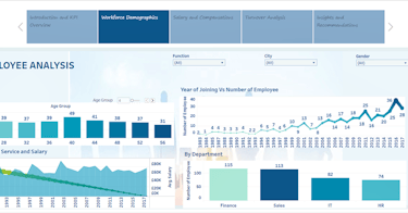
The dashboard covers multiple aspects such as age distribution, employee tenure, salary by department, and employee turnover. Interactive filters for function, city, and gender allow users to customise the analysis for targeted insights. Visualisations include bar charts, line graphs, and area charts that explore relationships between employee age, length of service, and compensation trends over time. With clear observations and data-driven insights, the dashboard helps HR professionals identify workforce patterns and develop effective strategies for talent management and retention.

